生成数据 安装matplotlib 1 $ pip3 install --user matplotlib
测试matplotlib 1 2 $ python3 >> import matplotlib
如果没有出现任何错误消息,就说明你系统安装了matplotlib。
matplotlib画廊 要查看使用matplotlib可制作的各种图表,请访问http://matplotlib.org/的示例画廊。单击画廊中的图表,就可查看用于生成图表的代码。
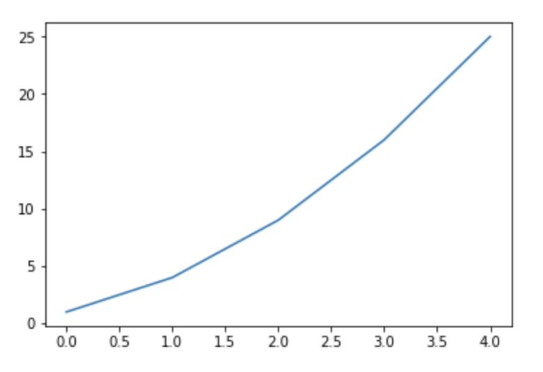
绘制简单的折线图plot() 我们将使用平方数序列1、4、9、16和25来绘制这个图标。
1 2 3 4 5 import matplotlib.pyplot as pltsquares = [1 ,4 ,9 ,16 ,25 ] plt.plot(squares) plt.show()
首先,导入了模块pyplot,并给它指定了别名plt。模块pyplot包含很多用于生成图标的函数。
我们创建了一个列表,在其中存储了前述平方数,再将这个列表传递给函数plot()。
plt.show()打开matplotlib查看器,并显示绘制的图形。
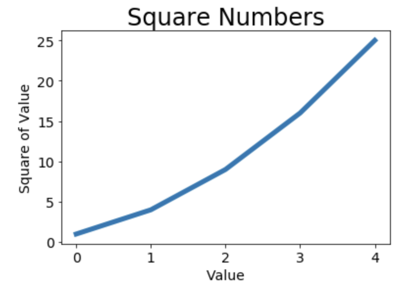
修改标签文字和线条粗细 1 2 3 4 5 6 7 8 9 10 11 12 13 14 import matplotlib.pyplot as pltsquares = [1 ,4 ,9 ,16 ,25 ] plt.plot(squares,linewidth=5 ) plt.title("Square Numbers" ,fontsize=24 ) plt.xlabel("Value" ,fontsize=14 ) plt.ylabel("Square of Value" ,fontsize=14 ) plt.tick_params(axis='both' ,labelsize=14 ) plt.show()
tick_params()设置刻度的样式,其中指定的实参将影响x轴和y轴上的刻度(axis=’both’),并将刻度标记的字号设置为14。
校正图形 我们发现没有正确的绘制数据:折线图的终点指出4.0的平方为25!下面来修复这个问题。
当你向plot()提供一系列数字时,它假设第一个数据点对应的x坐标值为0,但我们的第一个点对应的x值为1。为改变这种默认行为,我们可以给plot()同时提供输入值和输出值。
1 2 3 4 5 6 7 8 9 10 11 12 13 14 15 import matplotlib.pyplot as pltinput_values = [1 ,2 ,3 ,4 ,5 ] squares = [1 ,4 ,9 ,16 ,25 ] plt.plot(input_values,squares,linewidth=5 ) plt.title("Square Numbers" ,fontsize=24 ) plt.xlabel("Value" ,fontsize=14 ) plt.ylabel("Square of Value" ,fontsize=14 ) plt.tick_params(axis='both' ,labelsize=14 ) plt.show()
使用scatter()绘制散点图 1 2 3 4 import matplotlib.pyplot as pltplt.scatter(2 ,4 ) plt.show()
向函数scatter()传递一对x和y坐标,它将在指定位置绘制一个点。
优化此图形:
1 2 3 4 5 6 7 8 9 10 11 12 13 import matplotlib.pyplot as pltplt.scatter(2 ,4 ,s=200 ) plt.title("Square Numbers" ,fontsize=24 ) plt.xlabel("Value" ,fontsize=14 ) plt.ylabel("Square of Value" ,fontsize=14 ) plt.tick_params(axis='both' ,which='major' ,labelsize=14 ) plt.show()
Scatter()中的实参s设置了绘制图形时使用的点的尺寸。
使用scatter()绘制一系列点 要绘制一系列点,可向scatter()传递两个分别包含x和y的列表。
1 2 3 4 5 6 7 8 9 10 11 12 13 14 15 16 import matplotlib.pyplot as pltx_values = [1 ,2 ,3 ,4 ,5 ] y_values = [1 ,4 ,9 ,16 ,25 ] plt.scatter(x_values,y_values,s=100 ) plt.title("Square Numbers" ,fontsize=24 ) plt.xlabel("Value" ,fontsize=14 ) plt.ylabel("Square of Value" ,fontsize=14 ) plt.tick_params(axis='both' ,which='major' ,labelsize=14 ) plt.show()
将这些列表传递给scatter()时,matplotlib依次从每个列表中读取一个值来绘制一个点。
自动计算数据 手工计算列表要包含的值可能效率低下,需要绘制的点很多时尤其如此。可以不必手工计算包含点坐标的列表,而让Python循环来替我们完成这种事。下面绘制了1000个点。
1 2 3 4 5 6 7 8 9 10 11 12 13 14 15 16 17 18 19 import matplotlib.pyplot as pltx_values = list (range (1 ,1001 )) y_values = [x**2 for x in x_values] plt.scatter(x_values,y_values,s=40 ) plt.title("Square Numbers" ,fontsize=24 ) plt.xlabel("Value" ,fontsize=14 ) plt.ylabel("Square of Value" ,fontsize=14 ) plt.tick_params(axis='both' ,which='major' ,labelsize=14 ) plt.axis([0 ,1100 ,0 ,1100000 ]) plt.show()
函数axis()要求提供四个值:x和y坐标轴的最小最大值。
删除数据点的轮廓 matplotlib允许你给散点图中的各个点指定颜色。默认为蓝色点和黑色轮廓,在散点图不含数据不多时效果很好。但绘制很多点时,黑色轮廓可能会粘连在一起。删除轮廓,传递实参edgecolor。
1 plt.scatter(x_values,y_values,edgecolor='none' ,s=40 )
自定义颜色 修改数据点的颜色,向scatter()传递参数c,如下:
1 plt.scatter(x_values,y_values,c='red' ,edgecolor='none' ,s=40 )
你还可以使用RGB颜色模式自定义颜色。要指定自定义颜色,可传递参数c,并将其设置为一个元组,其中包含三个0~1之间的小数值,它们分别表示红色、绿色和蓝色分量。例如,下面代码将创建一个由淡蓝色点组成的散点图:
1 plt.scatter(x_values,y_values,c=(0 ,0 ,0.8 ),edgecolor='none' ,s=40 )
值越接近0,指定的颜色越深,越接近1,指定的颜色越浅。
使用颜色映射 颜色映射(colormap)是一系列颜色,它们从起始颜色渐变到结束颜色。在可视化中,颜色映射用于突出数据的规律,例如,你使用颜色深的表示数值大的,浅的表示小的。
模块pyplot内置了一组颜色映射。要使用这些颜色映射,你需要告诉pyplot如何设置数据集中每个点的颜色。下面演示如何根据每个点的y值来设置颜色:
1 2 3 4 5 6 7 8 9 10 11 12 13 14 15 16 17 18 19 20 21 import matplotlib.pyplot as pltx_values = list (range (1 ,1001 )) y_values = [x**2 for x in x_values] plt.scatter(x_values,y_values,c=y_values,cmap=plt.cm.Blues, edgecolor='none' ,s=40 ) plt.title("Square Numbers" ,fontsize=24 ) plt.xlabel("Value" ,fontsize=14 ) plt.ylabel("Square of Value" ,fontsize=14 ) plt.tick_params(axis='both' ,which='major' ,labelsize=14 ) plt.axis([0 ,1100 ,0 ,1100000 ]) plt.show()
我们将参数c设置成了一个y值列表,并使用参数cmap告诉pyplot使用哪个颜色映射。 将较小的点设置成浅蓝色,较深的点设置成深蓝色。
自动保存图表 让程序自动将图表保存到文件中,可将对plt.show()的调用替换为对plt.savefig()的调用:
1 plt.savefig('squares_plot.png' ,bbox_inches='tight' )
第一个实参指定要以什么样的文件名保存图表,这个文件存储到当前程序所在的目录中。第二个实参指定将图表多余的空白区域裁剪掉。如果要保留图表周围空白的区域,可省略这个实参。
例:画Sigmoid函数图 参考链接
1 2 3 4 5 6 7 8 9 10 11 12 13 14 15 16 17 18 19 20 21 22 23 24 25 26 27 28 29 30 31 32 33 34 import matplotlib.pyplot as pltimport numpy as np import mpl_toolkits.axisartist as axisartistfig = plt.figure(figsize=(8 , 8 )) ax = axisartist.Subplot(fig, 111 ) fig.add_axes(ax) ax.axis[:].set_visible(False ) ax.axis["x" ] = ax.new_floating_axis(0 , 0 ) ax.axis["x" ].set_axisline_style("->" , size=1.0 ) ax.axis["y" ] = ax.new_floating_axis(1 , 0 ) ax.axis["y" ].set_axisline_style("-|>" , size=1.0 ) ax.axis["x" ].set_axis_direction("top" ) ax.axis["y" ].set_axis_direction("right" ) x = np.arange(-15 , 15 , 0.1 ) y = 1 / (1 + np.exp(-x)) plt.xlim(-12 , 12 ) plt.ylim(-1 , 1 ) plt.plot(x, y, c='b' ) plt.show()
随机漫步 我们使用python来生成随机漫步数据,再使用matplotlib以引人瞩目的方式将这些数据呈现出来。
随机漫步数据 是这样行走得到的路径:每次行走都是完全随机的,没有明确的方向,结果是由一系列随机决策决定的。在自然界、物理学、生物学、化学和经济领域,随机漫步都有其实际用途。例如,漂浮在水面上的花粉因不断受到水分子的挤压而在水面上移动。花粉在水面上的运动轨迹犹如随机漫步。
创建RandomWalk()类 为模拟随机漫步,我们将创建一个名为RandomWalk的类,它随机的选择前进方向。
这个类需要三个属性,其中一个是存储随机漫步的次数的变量,其他两个是列表,分别存储随机漫步经过的每个点的x和y坐标。包含两个方法:_init() ,fill_walk(),其中后者计算随机漫步经过的所有点。
下面是init方法。(random_walk.py)
1 2 3 4 5 6 7 8 9 10 11 12 from random import choiceclass RandomWalk (): """一个生成随机漫步数据的类""" def __init__ (self,num_points=5000 ): """初始化随机漫步的属性""" self.num_points = num_points self.x_values = [0 ] self.y_values = [0 ]
我们将所有的可能都存储在一个列表中,并在每次做决策时都使用choice()来决定使用哪种选择。我们将随机漫步包含的默认点数设置为5000。
选择方向 使用fill_walk()来生成漫步包含的点,并决定每次漫步的方向。
1 2 3 4 5 6 7 8 9 10 11 12 13 14 15 16 17 18 19 20 21 22 23 24 def fill_walk (self ): """计算随机漫步包含的所有的点""" while len (self.x_values) < self.num_points: x_direction = choice([-1 ,1 ]) x_distance = choice([0 ,1 ,2 ,3 ,4 ]) x_step = x_direction * x_distance y_direction = choice([-1 ,1 ]) y_distance = choice([0 ,1 ,2 ,3 ,4 ]) y_step = y_direction * y_distance if x_step == 0 and y_step == 0 : continue next_x = self.x_values[-1 ] + x_step next_y = self.Y_values[-1 ] + y_step self.x_values.append(next_x) self.y_values.append(next_y)
方法choice([-1,1])将在-1,1表示在两者之间随机选择一个数。choice([0,1,2,3,4])是在这5个数中间随机选择一个数字,之所以包含0是因为可能点要沿垂直的方向行动。x_step与y_step是最终的步长,x_values[-1],Y_values[-1]取到列表的最后一个元素,它们也用来保存最新行动的点,即append()方法。
绘制随机漫步图 (rw_visual.py)
1 2 3 4 5 6 7 8 9 import matplotlib.pyplot as pltfrom random_walk import RandomWalkrw = RandomWalk() rw.fill_walk() plt.scatter(rw.x_values,rw.y_values,s=15 ) plt.show()
创建RandomWalk的实例rw,再调用fill_walk()。然后将实例中产生的x_values和y_values赋值给scatter()函数。
下图是包含5000个点的随机漫步图。
设置随机漫步图样式 我们将定制图表,以突出每次漫步的重要特征,并让分散注意力的元素不那么显眼。最终的结果是简单的可视化表示,清楚地指出了每次漫步经过的路径。
给点着色 我们使用颜色映射来指出漫步中各点的先后顺序,并删除每个点的黑色轮廓。我们传递参数c,并将其设置为一个列表,其中包含各点的先后顺序。由于这些点是按照顺序绘制的,因此给参数c指定列表只需包含数字1~5000。
1 2 point_numbers = list (range (rw.num_points)) plt.scatter(rw.x_values,rw.y_values,c=point_numbers,cmap=plt.cm.Blues,edgecolor='none' ,s=15 )
重新绘制起点和终点 除了给随机漫步的各个点着色,以指出它们的先后顺序外,如果还能呈现随机漫步的起点和终点就更好了。为此,可在绘制随机漫步图后重新绘制起点和终点。
1 2 3 4 plt.scatter(0 ,0 ,c='green' ,edgecolors='none' ,s=100 ) plt.scatter(rw.x_values[-1 ],rw.y_values[-1 ],c='red' ,edgecolors='none' , s=100 )
隐藏坐标轴 1 2 3 plt.axes().get_xaxis().set_visible(False ) plt.axes().get_yaxis().set_visible(False )
增加点数 调整屏幕以适应屏幕 1 2 plt.figure(dpi=227 ,figsize=(10 ,6 ))
函数figure()用于指定图表的宽度、高度、分辨率和背景色。你需要给figsize指定一个元组,单位为英寸。Python假定屏幕的分辨率为80像素/英寸,可利用形参dip向figure()传递该分辨率,有效的利用屏幕空间。
使用Pygal模拟掷骰子 我们将使用Python可视化包Pygal 来生成可缩放的矢量图形文件 。对于需要在尺寸不同的屏幕上显示的图表,这很有用,它们会自动缩放。如果你打算以在线方式使用图表,请考虑使用Pygal来生成它们,这样它们在任何设备上显示时都会很美观。
如果掷两个骰子,为确定哪些点数出现的可能性最大,我们将生成一个表示掷骰子结果的数据集,并根据结果绘制出一个图形。
安装Pygal 1 $ pip3 install --user pygal==1.7
Pygal画廊 要了解使用Pygal可创建什么样的图表,可查看图表类型画廊, http://www.pygal.org/,单击Documentation,再单击Chart types。每个示例都包含源代码。
掷单个骰子
同时掷两个骰子 同时掷两个骰子时,得到的点数更多,结果分布也不同。每次掷两个骰子时,我们将两个骰子点数相加,并将结果存在results中。(dice_visual.py)(以下是部分代码,其他自行修改)
1 2 3 for roll_num in range (100 ): result = die_1.roll() + die_2.roll() results.append(result)
下载数据 在本章中,将从网上下载数据,并对这些数据进行可视化。两种常见格式存储的数据:CSV 和 JSON。 我们将使用Python模块csv来处理CSV数据(逗号分隔的值)。然后,使用matplotlib根据下载的数据创建一个图表。这两者我们用来分析天气数据,找出不同地区在同一时间内的最高温和最低温。
使用模块json来访问以JSON格式存储的人口数据,并使用Pygal绘制一幅按国别划分的人口地图。
CSV文件格式 要在文本文件中存储数据,最简单的方式是将数据作为一系列以逗号分隔的值(CSV) 写入文件。这样的文件称为CSV文件。例如:下面是一行CSV格式的天气数据:
1 2014 -1 -5 ,13 ,15 ,14 ,23 ,34 ,6 ,32 ,18 ,19 ,30 ,29
CSV文件对人来说阅读起来比较麻烦,但程序可轻松地提取并处理其中的值,这有助于加快数据分析过程。
将少量锡特卡的CSV格式的天气预报数据(sitka_weather_07-2014.csv)下载到当前文件夹中。
分析CSV文件头 csv模块包含在Python标准库中,可用于分析CSV文件中的数据行,让我们能快速提取感兴趣的值。
1 2 3 4 5 6 7 8 9 import csvfilename = 'sitka_weather_07-2014.csv' with open (filename) as f: reader = csv.reader(f) header_row = next (reader) print(header_row) ['AKDT' , 'Max TemperatureF' , 'Mean TemperatureF' , 'Min TemperatureF' , 'Max Dew PointF' , 'MeanDew PointF' , 'Min DewpointF' , 'Max Humidity' , ' Mean Humidity' , ' Min Humidity' , ' Max Sea Level PressureIn' , ' Mean Sea Level PressureIn' , ' Min Sea Level PressureIn' , ' Max VisibilityMiles' , ' Mean VisibilityMiles' , ' Min VisibilityMiles' , ' Max Wind SpeedMPH' , ' Mean Wind SpeedMPH' , ' Max Gust SpeedMPH' , 'PrecipitationIn' , ' CloudCover' , ' Events' , ' WindDirDegrees' ]
调用csv.reader()将前面存储的文件对象作为实参传递给它,从而创建一个与该文件相关联的阅读器reader对象 。将阅读器存储在reader中。模块cav包含函数next() ,调用它将返回文件中的下一行。
reader处理文件中以逗号分隔的第一行数据,并将每个数据项都作为一个元素存储在列表中。
打印文件头及其位置 我们将文件头及其位置打印出来。
1 2 3 4 5 6 7 8 9 10 11 12 13 14 15 16 import csvfilename = 'sitka_weather_07-2014.csv' with open (filename) as f: reader = csv.reader(f) header_row = next (reader) for index,colum_header in enumerate (header_row): print(index,colum_header) 0 AKDT1 Max TemperatureF2 Mean TemperatureF3 Min TemperatureF4 Max Dew PointF.......
我们对列表调用了enumerate()来获取每个元素的索引及其值。从中可知,日期和最高气温分别存储在第0列和第一列。我们将处理文件中的每行数据,并提取其中索引为0和1的值。
提取并读取数据 首先读取每天的最高气温。
1 2 3 4 5 6 7 8 9 10 11 12 13 14 import csvfilename = 'sitka_weather_07-2014.csv' with open (filename) as f: reader = csv.reader(f) header_row = next (reader) highs = [] for row in reader: highs.append(row[1 ]) print(highs) ['64' , '71' , '64' , '59' , '69' , '62' , '61' , '55' , '57' , '61' , '57' , '59' , '57' , '61' , '64' , '61' , '59' , '63' , '60' , '57' , '69' , '63' , '62' , '59' , '57' , '57' , '61' , '59' , '61' , '61' , '66' ]
阅读器对象从其停留的地方继续往下读取csv文件,每次都自动返回当前所处位置的下一行。由于我们之前已经读取了文件头,这个循环将从第二行开始。
我们使用int()将这些字符串转化为数字,让matplotlib能够读取它们。
1 2 3 highs.append(int (row[1 ]) [64 , 71 , 64 , 59 , 69 , 62 , 61 , 55 , 57 , 61 , 57 , 59 , 57 , 61 , 64 , 61 , 59 , 63 , 60 , 57 , 69 , 63 , 62 , 59 , 57 , 57 , 61 , 59 , 61 , 61 , 66 ]
绘制气温图表 1 2 3 4 5 6 7 8 9 10 11 12 13 14 15 16 17 18 19 20 21 22 23 24 import csvfrom matplotlib import pyplot as pltfile_name = 'sitka_weather_07-2014.csv' with open (file_name) as f: reader = csv.reader(f) header_row = next (reader) highs = [] for row in reader: highs.append(int (row[1 ])) fig = plt.figure(dpi=128 ,figsize=(10 ,6 )) plt.plot(highs,c='red' ) plt.title("Daily high temperature,July 2014" ,fontsize=24 ) plt.xlabel('' ,fontsize=16 ) plt.ylabel('Temperature(F),fontsize=16' ) plt.tick_params(axis='both' ,which='major' ,labelsize=16 ) plt.show()
模块datetime 在天气数据文件中,第一个日期在第二行。地区该行时,获取的是一个字符串,因为我们需要将字符串“2014-7-1“转换为一个表示相应日期的对象。可使用模块datetime中的方法strptime()。
1 2 3 4 5 6 from datetime import datetimefirst_date = datetime.strptime('2014-7-1' ,'%Y-%m-%d' ) print(first_date) 2014 -07-01 00 :00 :00
“%Y-“让Python将字符串中第一个连字符前面的部分 视为四位的年份。strptime()可接受实参,并根据其解读日期。
实 参
含 义
%A
星期的名称,如Monday
%B
月份,如January
%m
用数字表示的月份,(01~12)
%d
用数字表示月份中的一天,(01~31)
%Y
四位的年份,如2015
%y
两位的年份,如15
%H
24小时制的小时数(00~23)
%I
12小时制的小时数(01~12)
%p
am或pm
%M
分钟数(00~59)
%S
秒数(00~59)
在图表中添加日期 调用fig.autofmt_xdate()来绘制斜的日期标签,以免它们彼此重叠。
1 2 3 4 5 6 7 8 9 10 11 12 13 14 15 16 17 18 19 20 21 22 23 24 25 26 27 28 29 import csvfrom datetime import datetimefrom matplotlib import pyplot as pltfile_name = 'sitka_weather_07-2014.csv' with open (file_name) as f: reader = csv.reader(f) header_row = next (reader) dates,highs = [],[] for row in reader: current_date = datetime.strptime(row[0 ],"%Y-%m-%d" ) dates.append(current_date) highs.append(int (row[1 ])) fig = plt.figure(dpi=128 ,figsize=(10 ,6 )) plt.plot(dates,highs,c='red' ) plt.title("Daily high temperature,July 2014" ,fontsize=24 ) plt.xlabel('' ,fontsize=16 ) fig.autofmt_xdate() plt.ylabel('Temperature(F),fontsize=16' ) plt.tick_params(axis='both' ,which='major' ,labelsize=16 ) plt.show()
最高与最低气温 导入”sitka_weather_2014.csv”数据,它记录了sitka地区整年的气温变化,我们观察最高与最低气温。
1 2 3 4 5 6 7 8 9 10 11 12 13 14 15 16 17 18 19 20 21 22 23 24 25 26 27 28 29 30 31 xiaimport csv from datetime import datetimefrom matplotlib import pyplot as pltfile_name = 'sitka_weather_2014.csv' with open (file_name) as f: reader = csv.reader(f) header_row = next (reader) dates,highs,lows = [],[],[] for row in reader: current_date = datetime.strptime(row[0 ],"%Y-%m-%d" ) dates.append(current_date) highs.append(int (row[1 ])) lows.append(int (row[3 ])) fig = plt.figure(dpi=128 ,figsize=(10 ,6 )) plt.plot(dates,highs,c='red' ) plt.plot(dates,lows,c='blue' ) plt.title("Daily high and low temperature,2014" ,fontsize=24 ) plt.xlabel('' ,fontsize=16 ) fig.autofmt_xdate() plt.ylabel('Temperature(F),fontsize=16' ) plt.tick_params(axis='both' ,which='major' ,labelsize=16 ) plt.show()
下面给图表区域着色。使用fill_between(),它接受一个x值与y值系列,并填充两个y值系列之间的空间。alpha 指定颜色的透明度。Alpha=0表示完全透明,1完全不透明。fill_between()传递了一个x值系列:列表dates,还传递了两个y值系列:highs和lows。facecolor指定了填充区域的颜色。
1 2 3 4 5 fig = plt.figure(dpi=128 ,figsize=(10 ,6 )) plt.plot(dates,highs,c='red' ,alpha=0.5 ) plt.plot(dates,lows,c='blue' ,alpha=0.5 ) plt.fill_between(dates,highs,lows,facecolor='blue' ,alpha=0.1 )
错误检查 数据的缺失可能引发异常,例如我们导入死亡谷的气温数据“death_valley_2014.csv”,并且运行上述代码。
1 ValueError: invalid literal for int () with base 10 : ''
结果显示,无法处理文件中的一行数据,因为它无法将空字符串转化为整数。我们打开文件,发现其中没有记录2014-2-16的数据,最高气温的字符串为空。
我们在csv文件中读取值时执行错误检查代码,对分析数据集时可能出现的异常进行处理。
1 2 3 4 5 6 7 8 9 10 11 12 13 14 --snip-- dates,highs,lows = [],[],[] for row in reader: try : current_date = datetime.strptime(row[0 ],"%Y-%m-%d" ) high = int (row[1 ]) low = int (row[3 ]) except ValueError: print(current_date,'missing data' ) else : dates.append(current_date) highs.append(high) lows.append(low) --snip--
可以看到,有一个数据没有读到。其他正常显示。
制作世界人口地图:JSON格式 Pygal提供了一个适合初学者使用的地图创建工具,使用它对人口数据进行可视化,以探索全球人口的分布情况。
文件population_data.json中包含全球大部分国家1960~2010的人口数据。
1 2 3 4 5 6 7 8 9 10 11 12 13 14 [ { "Country Name" : "Arab World" , "Country Code" : "ARB" , "Year" : "1960" , "Value" : "96388069" }, { "Country Name" : "Arab World" , "Country Code" : "ARB" , "Year" : "1961" , "Value" : "98882541.4" }, ......
这个文件实际上就是一个很长的Python列表,其中每个元素都是一个包含4个键的字典。国家名、国别码、年份、以及人口数量。
我们只关心人口数量。因此先将这些信息打印出来。
1 2 3 4 5 6 7 8 9 10 11 12 13 14 15 16 17 18 19 20 import jsonfile_name = 'population_data.json' with open (file_name) as f: pop_data = json.load(f) for pop_dict in pop_data: if pop_dict['Year' ] == '2010' : country_name = pop_dict['Country Name' ] population = pop_dict['Value' ] print(country_name + ":" + population) Arab World:357868000 Caribbean small states:6880000 East Asia & Pacific (all income levels):2201536674 East Asia & Pacific (developing only):1961558757 Euro area:331766000 ......
首先导入了json模块,以便正确的加载文件中的数据。然后将数据存储在pop_data中。函数pop_data 将数据转换为Python能够处理的格式,这里是一个列表。
可以看到,捕捉的数据中,并非每个都是国家名,现在将数据转换为Pygal能够处理的格式。
注意:将str转换为int时,若使用str(),如果数字(人口数量)为小数,则会发生错误,因为Python不能将包含小数点的字符串(如:“10.984958”)转化为整数。
应该先将其字符串转换为浮点数float(),再将浮点数转化为整数int()。 Python会自动抛弃小数部分。
1 2 population = int (float (pop_dict['Value' ])) print(country_name + ":" + str (population))
获取两个字母的国别码 population_data.json中包含的是三个字母的国别码,但Pygal使用两个字母的国别码。我们需要根据国家名获取两个字母的国别码。Pygal使用的国别码存储在模块i8n中。字典COUNTRIES包含的键和值分别是两个字母的国别码和国家名。要查看,可导入。
1 2 3 4 5 6 7 8 9 10 from pygal.i18n import COUNTRIESfor country_code in sorted (COUNTRIES.keys()): print(country_code,COUNTRIES[country_code]) ad Andorra ae United Arab Emirates af Afghanistan al Albania ......
为获取国别码,编写一个函数,它在COUNTRIES中查找并返回国别码。(country_codes.py)
1 2 3 4 5 6 7 8 from pygal.i18n import COUNTRIESdef get_country_code (country_name ): """根据指定的国家,返回Pygal使用的两个字母的国别码""" for code,name in COUNTRIES.items(): if name == country_name: return code return None
在之前的代码中导入。(world_population.py)
1 2 3 4 5 6 7 8 9 10 11 12 13 14 15 16 17 18 19 20 21 22 23 24 25 import jsonfrom country_codes import get_country_codefile_name = 'population_data.json' with open (file_name) as f: pop_data = json.load(f) for pop_dict in pop_data: if pop_dict['Year' ] == '2010' : country_name = pop_dict['Country Name' ] population = pop_dict['Value' ] code = get_country_code(country_name) if code: print(code + ":" + str (population)) else : print('ERROR -' + country_name) ...... ERROR -Algeria ERROR -American Samoa ad:84864 ......
制作世界地图 有了国别码后,制作世界地图易如反掌。Pygal提供了图表类型WorldMap,可帮助你制作呈现世界各国数据的世界地图。为了呈现,我们来创建一个突出北美、中美和南美的简单地图。
我们创建了一个Worldmap实例,并设置了该地图的title属性。
使用add方法,它接受一个标签和一个列表,后者包含我们要突出的国家的国别码 。每次调用add都将为指定的国家选择一种新颜色,并在左边显示该颜色和指定的标签。我们要以同一种颜色显示整个北美地区。
1 2 3 4 5 6 7 8 9 10 11 import pygalwm = pygal.Worldmap() wm.title = 'North,Central,and South America' wm.add('North America' ,['ca' ,'mx' ,'us' ]) wm.add('Central America' ,['bz' ,'cr' ,'gt' ,'hn' ,'ni' ,'pa' ,'sv' ]) wm.add('South America' ,['ar' ,'bo' ,'br' ,'cl' ,'co' ,'ec' ,'gf' , 'gy' ,'pe' ,'sr' ,'uy' ,'ve' ]) wm.render_to_file('americas.svg' )
在世界地图上呈现数字数据 1 2 3 4 5 6 7 import pygalwm = pygal.Worldmap() wm.title = 'Population of Countries in North America' wm.add('North America' ,{'ca' :34126000 ,'us' :30934900 ,'mx' :113423000 }) wm.render_to_file('na_populations.svg' )
这次的add方法,第二个参数传递的是一个字典而不是列表。这个字典将两个字母的Pygal国别码作为键,将人口数量作为值。Pygal根据这些数字自动给不同国家着以深浅不一的颜色(人口最少的国家颜色最浅,反之最深)
绘制完整的世界人口地图 在之前的world_population.py中添加如下代码:
1 2 3 4 5 6 7 8 9 10 11 12 13 14 15 16 17 18 19 20 21 22 23 24 25 26 import jsonimport pygalfile_name = 'population_data.json' with open (file_name) as f: pop_data = json.load(f) cc_populations = {} for pop_dict in pop_data: if pop_dict['Year' ] == '2010' : country_name = pop_dict['Country Name' ] population = int (float (pop_dict['Value' ])) code = get_country_code(country_name) if code: cc_populations[code] = population wm = pygal.Worldmap() wm.title = 'World Population in 2010,by Country' wm.add('2010' ,cc_populations) wm.render_to_file('world_population.svg' )
我们将根据人口数量将国家分组,再分别给每个组着色。
1 2 3 4 5 6 7 8 9 10 11 12 13 14 15 16 17 18 19 20 21 22 23 24 25 26 27 28 29 30 --snip-- from pygal.style import LightColorizedStyle as LCS, RotateStyle as RS--snip-- if code: cc_populations[code] = population cc_pops_1, cc_pops_2, cc_pops_3 = {}, {}, {} for cc, pop in cc_populations.items(): if pop < 10000000 : cc_pops_1[cc] = pop elif pop < 1000000000 : cc_pops_2[cc] = pop else : cc_pops_3[cc] = pop print(len (cc_pops_1), len (cc_pops_2), len (cc_pops_3)) wm_style = RS('# ' , base_style=LCS) wm = pygal.Worldmap(style=wm_style) wm.title = 'World Population in 2010, by Country' wm.add('0-10m' , cc_pops_1) wm.add('10m-1bn' , cc_pops_2) wm.add('>1bn' , cc_pops_3) wm.render_to_file('world_population.svg' ) 85 69 2
用Pygal设置世界地图样式 我们让Pygal使用设置指令来调整颜色。让三个分组的颜色差别更大。
1 2 3 4 5 6 7 8 9 --snip-- from pygal.style import RotateStyle--snip-- wm_style = RotateStyle('# ' ) wm = pygal.Worldmap(style=wm_style) --snip--
Pygal样式存储在模块style中,我们从中导入了RotateStyle样式。创建这个类的实例时,需要提供一个参数:16进制的RGB颜色;Pygal将根据指定的颜色为每组选择颜色。前两个字符表示红色分量,然后是绿色,蓝色。取值00~FF。建议搜索hex color chooser(16进制颜色选择器)
加亮颜色主题 我们使用LightColorizedStyle加亮了地图。
1 from pygal.style import LightColorizedStyle
但是使用这个类时,你不能直接控制使用的颜色,Pygal将选择默认的基色。要设置颜色,可使用RotateStyle,并将LightColorizedStyle作为基本样式。为此
1 from pygal.style import LightColorizedStyle as LCS,RotateStyle as RS
再使用RotateStyle创建一种样式
1 wm_style = RS('# ' , base_style=LCS)
这设置了较亮的主题,通过实参传递的颜色给各个国家着色。
使用API 编写一个独立的程序,并对其获取的数据进行可视化。这个程序将使用Web应用编程接口(API) 自动请求网站的特定信息而不是整个网页,再对这些信息进行可视化。由于这样编写的程序始终使用最新的数据来生成可视化,因此即便数据瞬息万变,它呈现的信息也都是最新的。
我们将使用GitHub的API来请求有关该网站中Python项目的信息,然后使用Pygal生成交互式可视化,以呈现这些项目的受欢迎程度。这个程序将自动下载GitHub上星级最高的Python项目的信息,并对这些项目进行可视化。
使用Web API GitHub的API让你能够通过API调用来请求各种信息。要知道API调用是什么样的,输入以下网址:
https://api.github.com/search/repositories?q=language:python&sort=stars
这个调用返回GitHub当前托管了多少个Python项目,还有有关最受欢迎的Python仓库的信息。仔细研究这个调用,第一部分(https://api.github.com/)将请求发送到GitHub网站中响应API调用的部分;接下来一部分(search/repositories)让API搜索GitHub上的所有仓库。
repositories后面的问号指出我们要传递一个实参。q表示查询,而等号能让我们开始指定的查询。通过使用language:python,我们指出只想获取主要语言为python仓库的信息,最后一部分查询&sort=stars指定项目将按其获得的星级进行排序。
1 2 3 4 5 6 7 8 9 { "total_count" : 1968718 , "incomplete_results" : false, "items" : [ { "id" : 21289110 , "name" : "awesome-python" , "full_name" : "vinta/awesome-python" , "owner" : {
上面显示了响应的前几行。从中可知,GitHub总共有1968718个python项目。”incomplete_results”的值为false,据此我们知道请求是成功的(它并非不完整的)。倘若GitHub无法全面处理该API,它返回的这个值将为true。接下来的列表中显示了返回的“items”,其中包含GitHub上最受欢迎的Python项目的详细信息。
安装requests requests包让python程序能够轻松地向网站请求信息以及检查返回的响应,要安装requests,执行类似于下面的命令:
1 $ pip3 install --user requests
处理API响应 下面的程序,它执行API调用并处理结果,找出GitHub上星级最高的Python项目。
1 2 3 4 5 6 7 8 9 10 11 12 13 14 15 import requestsurl = 'https://api.github.com/search/repositories?q=language:python&sort=stars' r = requests.get(url) print("Status code:" ,r.status_code) response_dict = r.json() print(response_dict.keys()) Status code: 200 dict_keys(['total_count' , 'incomplete_results' , 'items' ])
1.我们导入模块request。
2.使用requests来执行调用url。调用get()并将url传递给它,再将响应对象 存储在变量r中。
3.响应对象包含了一个名为status_code的属性,它让我们知道请求是否成功了。(状态码200表示成功了)
4.这个API返回一个json格式的信息,因此使用方法json()将这些信息转换为一个Python字典存储在response_dict
5.打印response_dict中的键。
处理响应字典 将API调用返回的信息存储到字典中后,就可以处理这个字典中的数据了。
1 2 3 4 5 6 7 8 9 10 11 12 13 14 15 16 17 18 19 20 21 22 23 24 25 26 27 28 import requestsurl = "https://api.github.com/search/repositories?q=language:python&sort=stars" r = requests.get(url) print("status code" ,r.status_code) response_dict = r.json() print("Total repositories returned:" ,response_dict['total_count' ]) repo_dict = response_dict['items' ] print("Repositories returned:" ,len (repo_dict)) repo_dict = repo_dict[0 ] print("\nKeys:" ,len (repo_dict)) for key in sorted (repo_dict.keys()): print(key) status code 200 Total repositories returned: 1970122 Repositories returned: 30 Keys: 70 archive_url .......
与item相关联的值是一个列表,其中包含很多字典,而每个字典都包含有关一个Python仓库的信息。
我们将这个字典列表存储在repo_dicts中。
repo_dict[0]提取第一个字典,并将其存储在repo_dict中。
接下来打印第一个仓库的字典中很多键相关的值。
1 2 3 4 5 6 7 8 9 10 11 --snip-- repo_dict = repo_dict[0 ] print("\nSelected information about first repository" ) print("Name:" ,repo_dict['name' ]) print("Stars:" ,repo_dict['stargazers_count' ]) Selected information about first repository Name: awesome-python Stars: 38871
概述最受欢迎的仓库 1 2 3 4 5 6 7 8 9 10 11 12 --snip-- repo_dict = response_dict['items' ] print("Repositories returned:" ,len (repo_dict)) print("\nSelected information about first repository" ) for repo_dict in repo_dicts: print("Name:" ,repo_dict['name' ]) print("Stars:" ,repo_dict['stargazers_count' ]) print("Repository:" ,repo_dict['html_url' ]) print("Description:" ,repo_dict['description' ])
监视API的速率限制 大多数API都存在速率限制,即你在特定时间内可执行的请求数存在限制。要获悉你是否接近GiHub的限制,请输入https://api.github.com/rate_limit
1 2 3 4 5 6 7 8 9 10 11 12 { "resources" : { "core" : { "limit" : 60 , "remaining" : 60 , "reset" : 1506236519 }, "search" : { "limit" : 10 , "remaining" : 10 , "reset" : 1506232979 },
search中,limit代表每分钟10个请求,而在当前这一分钟,我们还可以执行10个请求。若到达配置,你必须等待配额重置。
使用Pygal可视化仓库 现在进行可视化,呈现GitHub上Python项目最受欢迎程度。条形的高低代表获得了多少颗星。
1 2 3 4 5 6 7 8 9 10 11 12 13 14 15 16 17 18 19 20 21 22 23 24 25 26 27 28 29 import requests import pygalfrom pygal.style import LightColorizedStyle as LCS,LightenStyle as LSurl = "https://api.github.com/search/repositories?q=language:python&sort=stars" r = requests.get(url) print("status code" ,r.status_code) response_dict = r.json() print("Total repositories returned:" ,response_dict['total_count' ]) repo_dicts = response_dict['items' ] names,stars = [],[] for repo_dict in repo_dicts: names.append(repo_dict['name' ]) stars.append(repo_dict['stargazers_count' ]) my_style = LS('# ' ,base_style=LCS) chart = pygal.Bar(style=my_style,x_label_rotation=45 ,show_legend=False ) chart.title = "Most-Starred Python Projects on GitHub" chart.x_labels = names chart.add('' ,stars) chart.render_to_file('python_repos.svg' )
x_label_rotation=45让标签绕x轴旋转45度,并隐藏了图例show_legend=False
改进Pygal图表 下面来改进这个图表的样式,创建一个配置对象,在其中包含要传递给Bar()的所有配置。
1 2 3 4 5 6 7 8 9 10 11 12 13 14 15 16 17 18 --snip-- my_style = LS('# ' ,base_style=LCS) my_config = pygal.Config() my_config.x_label_rotation = 45 my_config.show_legend = False my_config.title_font_size = 14 my_config.major_label_font_size = 18 my_config.truncate_label = 15 my_config.show_y_guides = False my_config.width = 1000 chart = pygal.Bar(my_config,style=my_style) chart.title = "Most-Starred Python Projects on GitHub" chart.x_labels = names chart.add('' ,stars) chart.render_to_file('python_repos.svg' )
我们创建了一个Pygal类Config的实例,并将其命名为my_config,通过修改my_config,可定制图表的外观。truncate_label将较长的项目名缩短为15个字符。show_y_guides为False将隐藏图表中的水平线。width为自定义宽度,让图表更充分地利用浏览器中的可用空间。
添加自定义工具提示 在Pygal中,将鼠标指向条形将显示它表示的信息,这通常称为工具提示 。在这个示例中,当前显示的是项目获得了多少个星。我们向add()传递字典列表,而不是值列表。
1 2 3 4 5 6 7 8 9 10 11 12 13 14 15 16 17 import pygalfrom pygal.style import LightColorizedStyle as LCS,LightenStyle as LSmy_style = LS('# ' ,base_style=LCS) chart = pygal.Bar(style=my_style,x_label_rotation=45 ,show_legend=False ) chart.title = 'Python Project' chart.x_labels = ['httpie' ,'django' ,'flask' ] plot_dicts = [ {'value' :16101 ,'label' :'Description of httpie.' }, {'value' :15028 ,'label' :'Description of django.' }, {'value' :14798 ,'label' :'Description of flask' } ] chart.add('' ,plot_dicts) chart.render_to_file('bar_description.svg' )
每个字典都包含两个键:“value”和“label”。Pygal根据与键“value”相关联的数字来确定条形的高度,并使用“label”相关联的字符串给条形创建工具。
根据数据绘图 为根据数据绘图,我们将自动生成plot_dicts,其中包含API调用的30个项目的信息。
1 2 3 4 5 6 7 8 9 10 11 12 13 14 15 16 17 18 19 --snip-- repo_dicts = response_dict['items' ] names,plot_dicts = [],[] for repo_dict in repo_dicts: names.append(repo_dict['name' ]) plot_dict = { 'value' :repo_dict['stargazers_count' ], 'label' :repo_dict['description' ], } plot_dicts.append(plot_dict) --snip-- chart.add('' ,plot_dicts) --snip--
在图表中添加可单击的链接 Pygal允许你将图表中的每个条形用作网站的相应链接。
1 2 3 4 5 6 7 8 9 --snip-- plot_dict = { 'value' :repo_dict['stargazers_count' ], 'label' :repo_dict['description' ], 'xlink' :repo_dict['html_url' ], } --snip--